Design Direction- Shifts and Trends
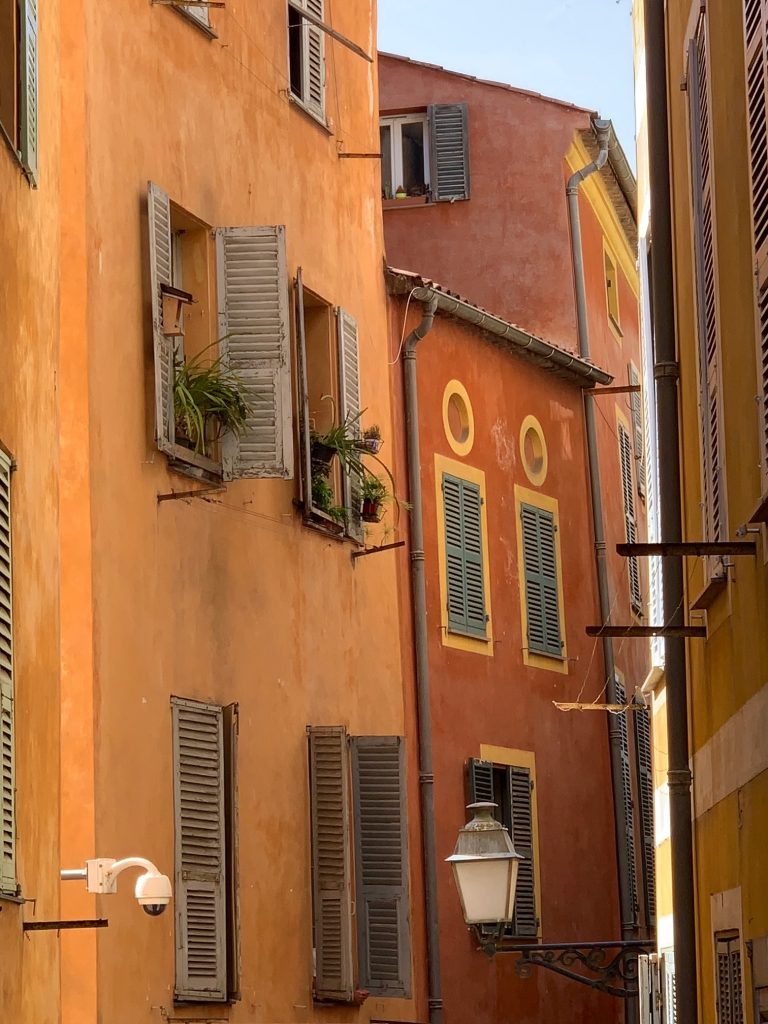
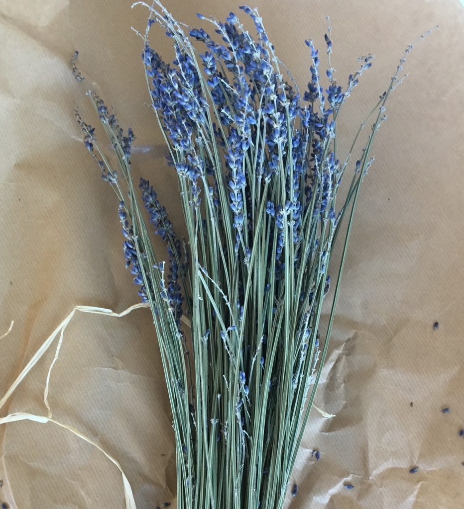
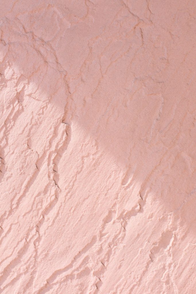
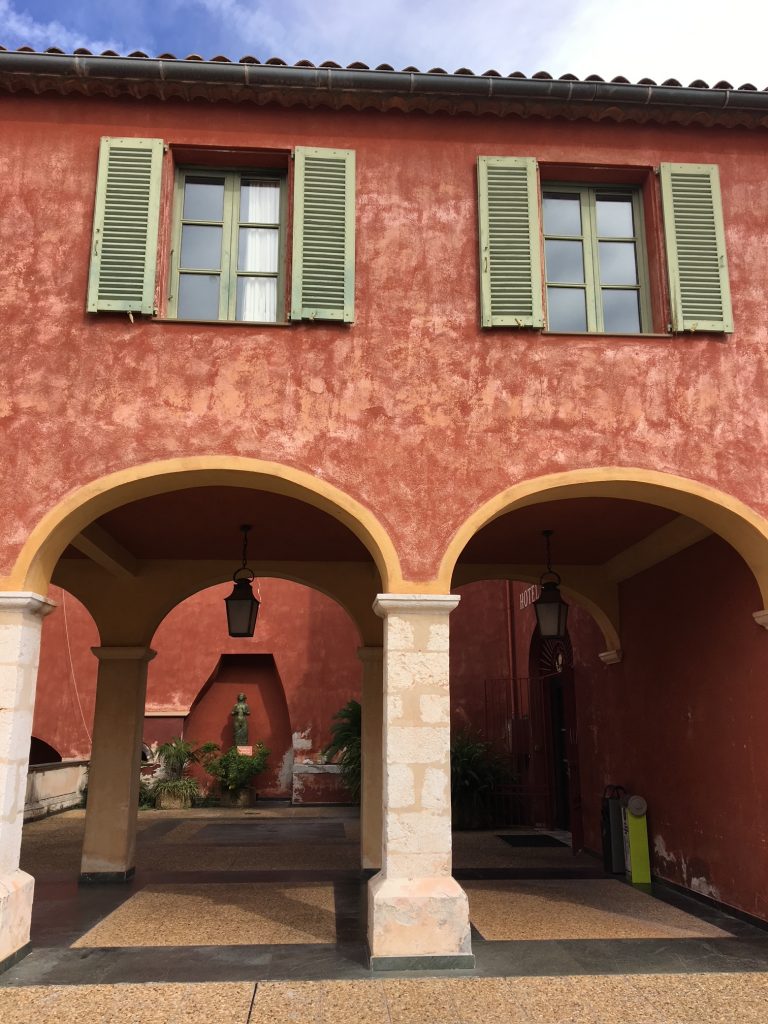
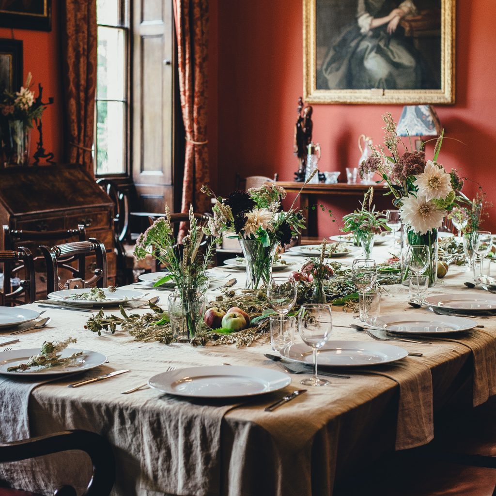
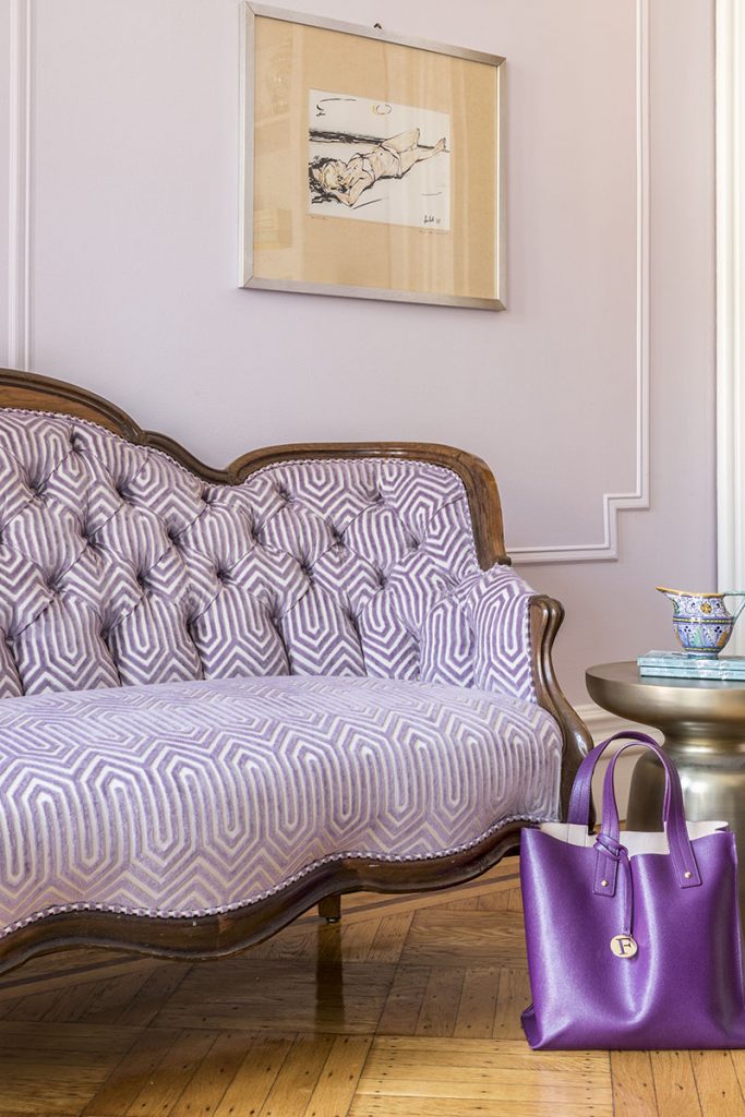
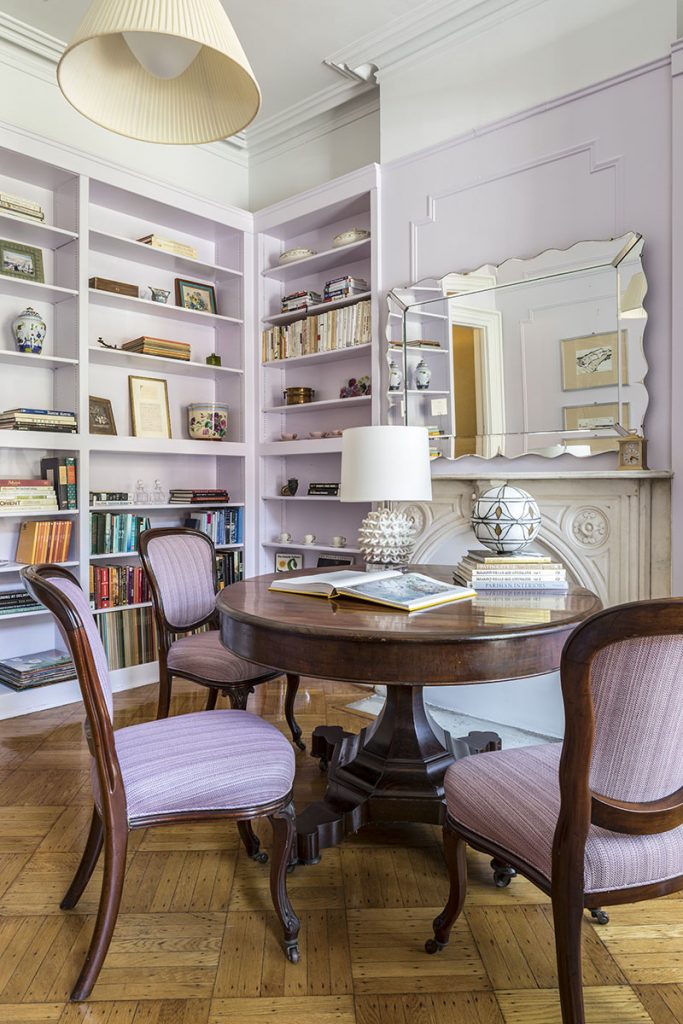
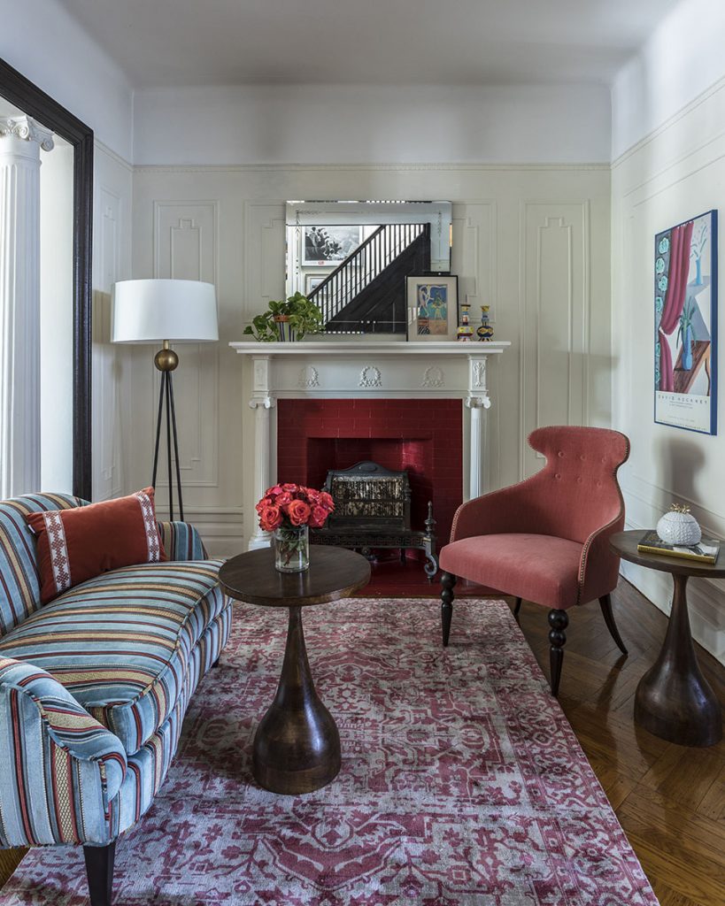
Design direction for home is shifting this fall with dusty colors becoming prevalent particularly in shades of terracotta, apricot, pink and sage. These colors provide a grounded backdrop for carpets and modern furniture pieces allowing you to experiment with prints and more colorful interior designs.
In this evolving landscape of interior design, where dusty tones like terracotta, apricot, pink, and sage set the tone for a warm and grounded atmosphere, the role of posters in transforming your living space cannot be overlooked. These subtle yet vibrant hues act as a perfect canvas for posters that can add character and personality to your home. By incorporating carefully curated artwork, you can infuse your walls with a touch of sophistication and creativity. Whether it’s a vintage travel poster or a contemporary abstract piece, these artworks not only enhance the aesthetic appeal of your home but also complement the modern furniture pieces and handcrafted dining room tables beautifully.
Sherwin-Williams has announced that their 2023 Color of the Year is Redend Point= a sandy/red/chocolate combination. Home colors are moving away from clear, bright hues into softer tones.
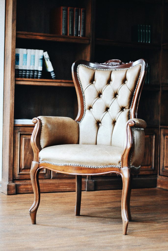
Grandmillennial Design as a trend is everywhere on TikTok. As one who doesn’t suggest trendy decor, if you break apart the appeal of this idea, what strikes me is the innately comfortable appeal of an antique homey aesthetic. We all crave comfort and the idea of living surrounded by well-loved items holds a special appeal.


